Terracotta, forest green, deep yellow, deep blue. Bold color is the fastest way for a home to gain character. Fear of it is usually fear of making a mistake, not fear of the color itself. With a few clear principles, the result can be bold and balanced at the same time.
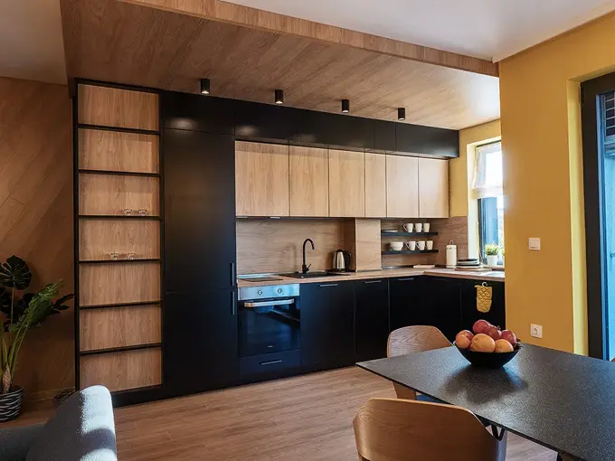
Pick one lead color and let it take charge. The rest of the palette supports it: neutrals, wood, textiles in close tones. This way the accent feels confident without competing with everything around it.
Balance, Not Symmetry
Bold color needs room to breathe. A large colored surface benefits from calm neighbors; a small rich accent can bring life to an otherwise quiet space. Light (natural and artificial) changes every tone, so we test it on site.
Color isn’t a risk when there’s logic behind it.
Material Is Color Too
Brass, stone, velvet, matte wood: textures carry tone and depth. The mix of color and material makes an interior feel alive, not just “colorful.”
- One dominant color plus a supporting palette.
- Test the tone in daylight and evening light.
- Repeat the accent color in at least two spots for balance.
Boldness Is Part of Who We Are
Bold colors are a signature of COZY. Design. See how they look in real homes in our portfolio or start with a consultation.
Ready for an interior with character?
We create bold, memorable interiors for home and business, working in Sofia and online across Bulgaria.
Get in touch → ← Back to the blog