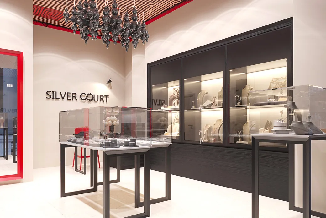
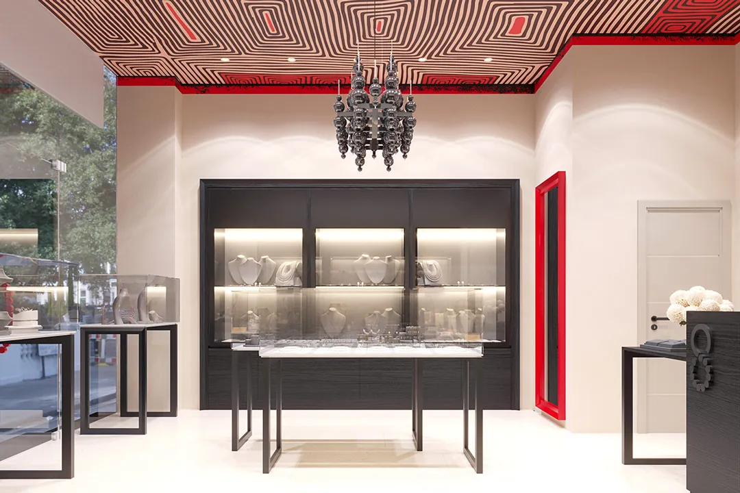
A full rebranding of the Silver Court store chain. Our goal was to give the stores character, make them recognisable both on a main shopping street and in a mall, and create branding that would still be current over the next 5–6 years.
The brand built into the interior
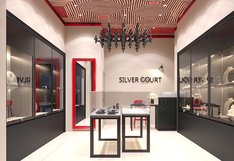
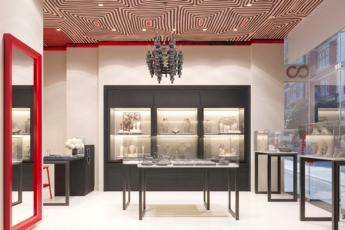
To that end we incorporated elements from the logo into the interior design and added a colour to the branding to be associated with the brand.
Bold monochrome with a classic red
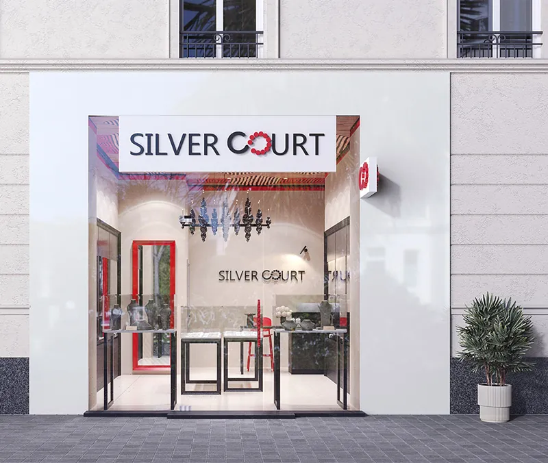
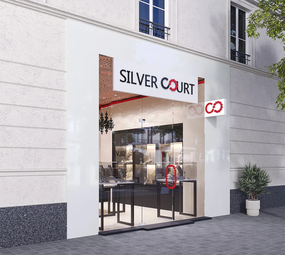
As a style, we committed to a design that was not yet current in Bulgaria in the year it was created and was about to become a trend. A monochrome interior with a bold detail in classic red. We planned a crosswise logo on the facades, visible from passing foot traffic, along with a red accent on the beads symbol on the main sign.
A design for every store in the chain
The design has to work across all current and future stores of the brand. Given that the premises are rented, it had to stay recognisable on whatever flooring it was placed, and be applicable to the suspended ceiling with existing downlights typical of a retail space.
Frequently asked questions
Do you like this project?
Let's create something equally bold for your space.
Request a project → ← All projects